Let's Implement Glassmorphism with CSS!
Learn How To Create a Frosted Glass Effect.

Chimaobi is an enthusiastic blockchain developer and an engineering undergrad. He's passionate about building the next iteration of the internet and building in the web3 space.
Hello friend, need that winter frosted glass effect? 🥶
It's called Glassmorphism. It is a design style coined by Michal Malewicz to connect and combine all the uses of the "frosted glass" effect in the user interface (UI). Thanks to the improved support for the backdrop-filter across desktop browsers, we can now create that cold winter night glass effect and enhance your UI experience!
So let's start by making a personal card with Glassmorphism using HTML & CSS step by step.
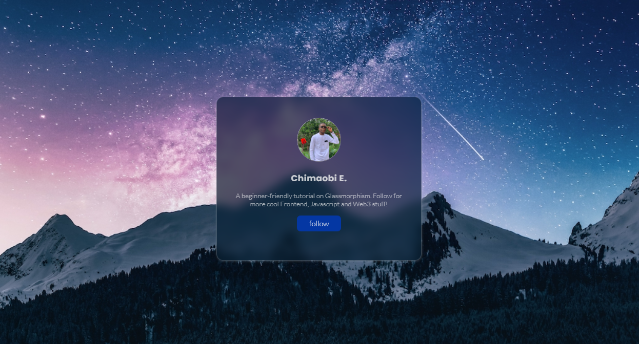
Take a good look at the preview above before we start coding the project . We will code the HTML first then the CSS comes next. I have shared the code snippets below to make it easier for you.
HTML 🎈( step 1)
    <head>
        <meta charset="UTF-8">
        <meta http-equiv="X-UA-Compatible" content="IE=edge">
        <meta name="viewport" content="width=device-width, initial-scale=1.0">
        <title> Frosted Glass </title>
        <link rel="stylesheet" href="./style.css">
        <link rel="icon"
            href="data:image/png;base64,iVBORw0KGgoAAAANSUhEUgAAANIAAADwCAMAAABCI8pNAAAAe1BMVEX///8AAADCwsK8vLwiIiLm5ubq6uru7u7V1dX39/dmZmbx8fF3d3f29vb7+/tLS0s0NDSWlpZRUVGxsbF/f3+FhYXZ2dmnp6cLCwstLS3Ly8sYGBifn58cHBw3NzdXV1eOjo4nJydAQEBsbGxycnK1tbVcXFxERERpaWnhBXsHAAAGq0lEQVR4nO2d61bqMBBGq+dAuQhUBARUBLyd93/CY2lppm2mSTRr8Y3O/kmT0r2ATK5DkuRsF9n6SjjrbDlIzqSzSz9OLOZpaXTpB4nJ5KR0uPRjxCTLje4v/RRxuftU+nvph4jLJkl6l36G2PST60s/Qmy2yZ9LP0JsrlVJAKokAVWSwK9Q+tvvxaX5lpFv32926CxKSWSaSrHvr0oxUKVgVCkGqhSMKsVAlYJRpRioUjCqFANVCkaVYqBKwahSDFQpGFWKgSoFo0phpIOx5VXJSjeftZftl+UqjQ+n6netC2KVBmX1WeuKVKVq186hdUmo0qKqftO6JlJpavbzrSetqxKVeg9V5WPbSKIS2YTU/tYlEpVuTdVHawFxSiNTc2svIUwp3Zh6faaMLKWBqfY85QqJUroztSx9uzOSlG5MpbeOYnKUhnNTZ9VVUIwSia+ZbZRkkKJE4uuLo6gQJWd8JchQGtEbuJCg5BNfCQKUSHyds/GVgK/kF18J8Epm/NoZXwngSlMSXwddBQnYSiS+brrjKwFaicTXf1yZdNVsMpCVPOLr9PXz4n39NWAlj/i6erBchlUi8fWpx9z8sSwwr72KquQRXyfP5xI7CUokvi6YOxPp+twXphKJr+2ViQLSdlyl8EpkfpiLrxNS5KNuhKhE42tqu2ftS9fu+OEpkesj5qb08Et7fhJOifxGbrmbLqsiM0s3CU3Ja/z6ei6yt10FU9pVLz9w8TUxIdbedmApPVavzoZddz31LN4ta0s5WEpVf8C6cGQYLp5m7IAQS+k8RXxvv9n09mXZ8X0swVIq4w0TX4u2u3PyOAdL6fRj2jETW9ui/M5+1QCmlEwG3KdQNR2uETuaEovpybrm8qQoVW2hc5ZfiFL6VBV/dhYWoUQ63tyAkCBB6c0UZgJWDQFKe1OW2elQB1/ppSq5dvccctCVpseqYMZ0U5uAK/VMFj1uiNsCW2lriu293xJaieRo4+a+LCArkdk837WlHGAl0wfyWXQ2wCqNs6rEh8+iswFVaWUKvAa+JagSKcTO5nFgKpmZoqs/wW8JqWT6QO6ZhjaASkOzKsFN83eCp9Q3w7259ZYu4JTChns20JTIVgef4Z4NNCVa8ouAKZkI6zfcswGmdE5ivfMc7tkAU0qKBvz9O2+JppTmFfbfeks0pc+R7NvXf0Yn8JS+jSoFo0oxUKVgVCkGqhSMKsUgptLd/rE1iShaqZgzaPbPJCuV6yYfjZcFK1W7oBtfPblKS+4GYpXM9s3m3hGhShOzbnJsNnkylci6SXt/j0glMploWTeRqETWTWy7TQUqkYQF1nUTeUrmQOXBvm4iTSk9VPVmzBKxMCX2UBRBlhLZJscnLBClRI6wdKybSFL6Z+p0LRHLURp+VDW6M5mIURqbJ3XsCJaiRJo6VwoGIUohO4JlKJGmzr0jWISSGe757AgWoDQ0O4KPnWfbSvCVgncEwyuR4d7e7/7oSuTUsWe2GXglM7XlvSMYXek8hD0wfaDV4qa5yRFdqdyKzqV5PAWsRquBrpScZvK54d57cYf654SrVH4u0+VuzjQMVfqWujGqUjq6Wjv6p6YnW9/rCKpURKPOHegkfUu9McRUOrdzHbuByWxeYxoCUalXpThiu900fUtzGgJQiXyjuCkGkr6l3TfHUyKTJtyInPT72qn/4ZRW5IG4aEQGhLZGEUyJnFtjT3OQ9C3Ws21YSuRsYcYc8xqb9GjMTw1LyXwAHpnCdkxPFkupapq5Lx1pDdkhLpZS+cM/ciGWHKiUMs0/PcUbrm9H04/KmeYf7ucjrstAThl15XVCU+qAxNfuc1NilEjEcgw6pCiRjrfr7LgMJTLh6j5QKUJpZSZcufhKkKBEnojNS0wQoERyszjz/ufgKwXl/c9BVyId7874SgBXov+r43t/bCUSX/3PJUMrkY53wLlkYCWydyMoNwuuElnQzIISFsAqkY63d9KmAlQln7zEDKBKwfGVAKlEEgJ5ZnOjICqF/q9OA0Cl4P/VaYCnRGZcA3KfEfCUzMrRFxIC5eApnZeOPMavdvCUyvbbZ/xqB0+p2DXkNX61g6eUrEbZKKSb2gRQ6buoUgxUKRhVioEqBaNKMVClYFQpBqoUjCrFQJWCUaUYqFIwqhQDVQpGlWKgSsH8TqW0H5emUuTbp24l8aiSBFRJAqokgR+pdO0uJIstTU35M+iX6Qh+DpukfhD0B3DaiLRxl5ND8YfhqbugGNbl//VMnt1lZfBu0ksNFtnaXQGbdbYs9u38B8iFew7PbSWKAAAAAElFTkSuQmCC">
    </head>

    <body>
        <div class="glass">
            <a href="https://github.com/Mobey-eth">
                <img src="./Your-image.jpg" alt="Your picture">
            </a>
            <p class="name"> Your Name </p>
            <p class="text"> A beginner-friendly tutorial on Glassmorphism.
                Follow for more cool Frontend, Javascript and Web3 stuff!
            </p>
            <button>
                <a href="twitter.com/0xmobi">follow</a>
            </button>
        </div>
    </body>
In the HTML, we used div tags for the container, we then proceed to design the card with CSS.
CSS🎈( step - 2)
We address the background in the body tag and we set the height. This is essential to centering the "glass" class using flex.
body {
    background-image: url("https://images.unsplash.com/photo-1519681393784-d120267933ba?ixid=MnwxMjA3fDB8MHxwaG90by1wYWdlfHx8fGVufDB8fHx8&ixlib=rb-1.2.1&auto=format&fit=crop&w=1124&q=100"); background-position: center;
    background-repeat: no-repeat;
    background-size: cover;
    height: 100vh;
    display: flex;
    align-items: center;
    justify-content: center;
}
Next, we set the display and specify the dimensions of the card on the "glass" class. I also like to add the "z-index" to give the card some sort of popping effect.
.glass {
    display: block;
    width: 30rem;
    height: 24rem;
    border-radius: 1rem;
    z-index: 500;
}
Then for the secret sauce, we set the background color of the "glass" class and we add the "backdrop-filter", its optional to add a semi transparent border but it helps to highlight the edges.
.glass {
  background: rgba(12, 30, 45, 0.7);
  backdrop-filter: blur(0.7rem) saturate(180%);
  box-shadow: 0.05rem 0.1rem 0.3rem rgba(255, 255, 255, 0.2);
  border: 0.1rem solid rgba(255, 255, 255, 0.2);
}
You can also use the "white frosting glass effect" if you will, just adjust the background of the "glass" class to background: rgba(255, 255, 255, 0.6); and voilà!
All that's left is to style the elements in the card to your satisfaction 😁. Remember there are no limits, go out there and do really creative stuff with this cool frosted glass effect you just learned!
Here is the rest of the CSS to make it even easier for you. 😉
@import url("https://fonts.googleapis.com/css2?family=Lato:wght@100;300&family=Poppins:wght@200;500;600;700&display=swap");

* {
  margin: 0;
  padding: 0;
  box-sizing: border-box;
}

:root {
  --color-one: rgba(12, 30, 45, 0.7);
  --color-two: #aa3333;
}

html {
  font-size: 62.5%;
  font-family: "Lato", sans-serif;
  font-family: "Poppins", sans-serif;
}

body {
  background-image: url("https://images.unsplash.com/photo-1519681393784-d120267933ba?ixid=MnwxMjA3fDB8MHxwaG90by1wYWdlfHx8fGVufDB8fHx8&ixlib=rb-1.2.1&auto=format&fit=crop&w=1124&q=100");
  background-position: center;
  background-repeat: no-repeat;
  background-size: cover;
  height: 100vh;
  display: flex;
  align-items: center;
  justify-content: center;
}

.glass {
  display: block;
  width: 30rem;
  height: 24rem;
  background: var(--color-one);
  border-radius: 1rem;
  z-index: 500;
  -webkit-backdrop-filter: blur(0.7rem) saturate(180%);
  backdrop-filter: blur(0.7rem) saturate(180%);
  box-shadow: 0.05rem 0.1rem 0.3rem rgba(255, 255, 255, 0.2);
  border: 0.1rem solid rgba(255, 255, 255, 0.2);
  text-align: center;
  color: #f2f2f2;
}

.glass .name {
  font-family: poppins, sans-serif;
  font-weight: bold;
  font-size: 1.25rem;
  margin: 0.8em;
  color: rgba(242, 242, 242, 0.8);
  letter-spacing: 0.5px;
}

.glass .text {
  font-family: "Lato", sans-serif;
  color: rgba(242, 242, 242, 0.631372549);
  padding: 0 1.6rem;
}

.glass button {
  margin: 1.1rem;
  padding: 0.3rem 1.7rem;
  background-color: #0437a3;
  border: 0.1rem solid #0437a3;
  border-radius: 0.5rem;
}

.glass button a {
  font-family: lato, sans-serif;
  text-decoration: none;
  font-size: 1.1rem;
  color: rgba(242, 242, 242, 0.8784313725);
}

.glass button:hover {
  cursor: pointer;
  background-color: rgb(209, 177, 134);
  color: white;
  font-weight: bold;
}

img {
  height: 6.5rem;
  width: 6.5rem;
  border-radius: 50%;
  margin-top: 3rem;
  border: 1px rgba(242, 242, 242, 0.5607843137);
  border-style: groove;
}
CONCLUSION
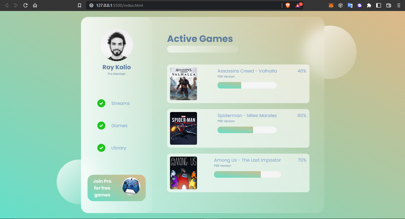
Now we have done the CSS coding, If you want to see a more robust example where I used the glass effect to make a user dashboard click the link below.
Got some questions or suggestions? don't hesitate to leave them in the comments section. Kindly follow and have fun!
